|
Hello, blog readers! It's been a while since I last blogged about anything besides Fitbit, and even then it's been sparse. I apologize, but if you've read my good friend Will's latest Stata blog post, you'll see it's for good reason. I recently moved to Seattle and life got a little hectic the last couple of months with moving and job hunting, so blogging got put on the back burner. More updates on my move in a later post!
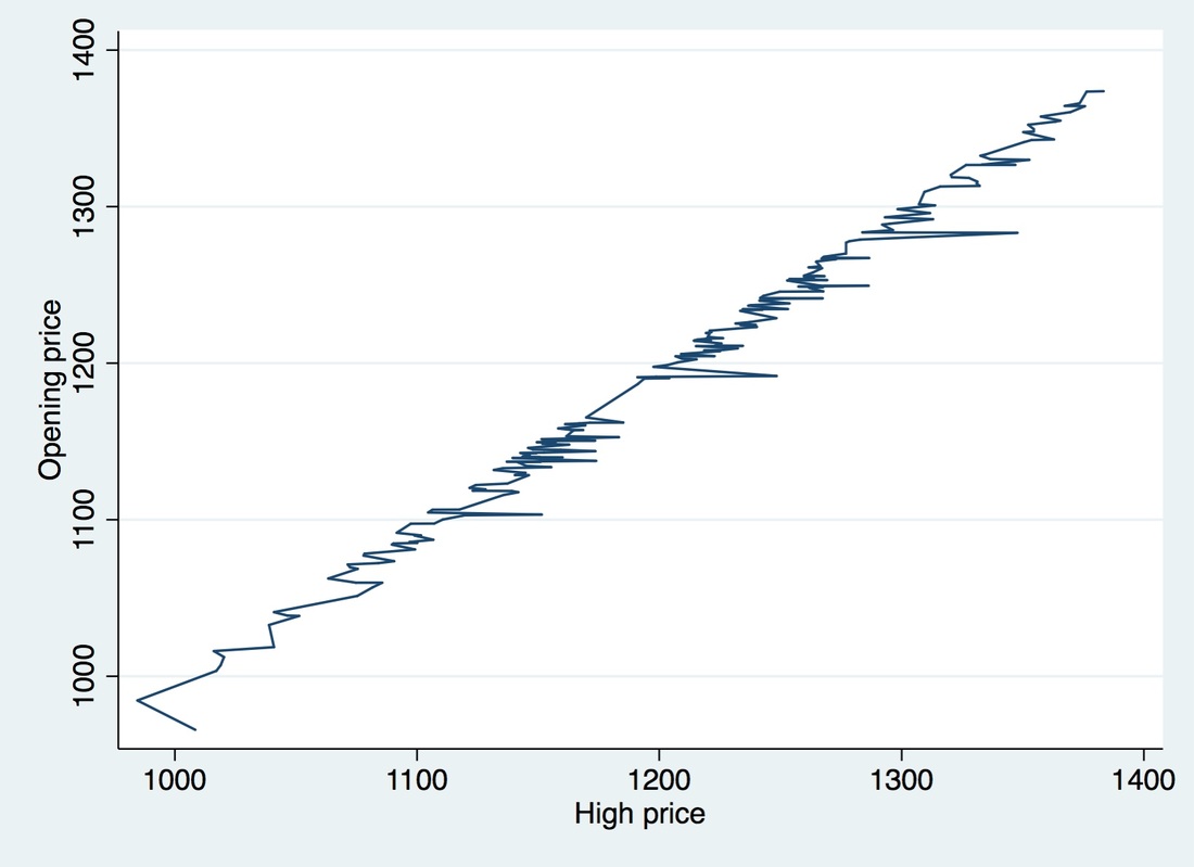
In that same blog post I mentioned above, Will briefly mentions our joint presentation at the Stata User Group Meeting coming up in July. I thought this would be great opportunity for me to follow up on that topic here and and get into the details of what we've been working on. Our program is called gcharts and it has required learning a lot about Stata graphics like studying all the different options for all kinds of graph types. Like his post says, we've studied "Stata graphics enough to be labeled as completely crazy, but at least it has resulted in a marvelous presentation". Well put, Will. Anyway, we've been able to apply what we've learned in such a way that Stata users will now be able to render web-based graphics through Google Charts. The abstract we submitted is below: Stata graphics are professional, visually pleasing, and easy to format, but lack the interactive experience or transparency options requested by many users. In this presentation, we introduce a new command, gchart: it is a fully functional wrapper for the Google Chart API, which is written almost entirely like the twoway command, and allows users to write quality JavaScript data visualizations using familiar Stata graphing syntax. While other Google Chart-based programs already exist, gchart aims to be the most comprehensive library to date. With gchart, Stata users can present interactive web-based graphics without exporting their data to secondary software packages or learning JavaScript and HTML. The gchart library contains most Stata graph types such as bar, pie, and line as well as new graphs offered by Google Charts such as treemaps, timelines, Sankey diagrams, and more! The command contains an option to create interactive tables directly from datasets and even has preset settings to make resulting Google Charts feel more Statalike. Once the visualizations are rendered, web visitors and blog readers will be happy to play with the resulting graphics. So, why Google Charts? Well, Will and I both like the functionality of Google Charts. They offer a suite of tables, traditional graphs, and other types of data visualizations. It doesn't require the installation of additional software and using it is pretty straightforward. Why Google Charts + Stata? Because both of us already do everything on Stata (Stata is the best) and we wanted web-based graphics that we could automate. Once you do something over and over again, you might as well make a program for it (Thanks for that important lesson, Will) and this project started budding over that idea. Combining Google Charts API with Stata isn't new, but like our abstract says, we made sure to make the program resemble Stata's twoway so that Stata users can quickly and easily start making web-based graphics without needing to pick up JavaScript or HTML. Let's see an example: If you want to make a line graph in Stata you'd type something like the following. Note we're using S&P500 data and we're making some missing data for our "high" variable: sysuse sp500, clear replace high = . in 100/120 * Interpolate missings - default in Stata line open high, cmissing(yes) * Same as writing: line open high
Gives us the following graph:
If you wanted to make a line graph using that same dataset in Google Charts API you'd have to do write out the data (note I truncated the data below to make it easier to read) and add any additional options as follows:
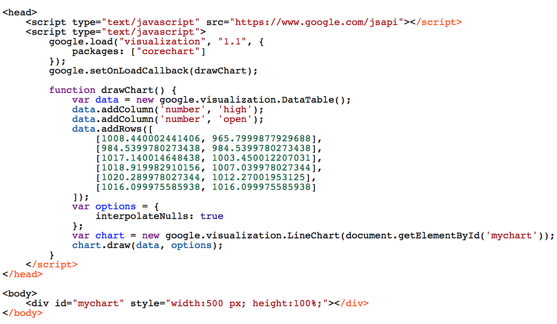
Or we could do it as follows:
*In gcharts - interpolating missings is not the default
 gchart line open high, cmissing(yes)
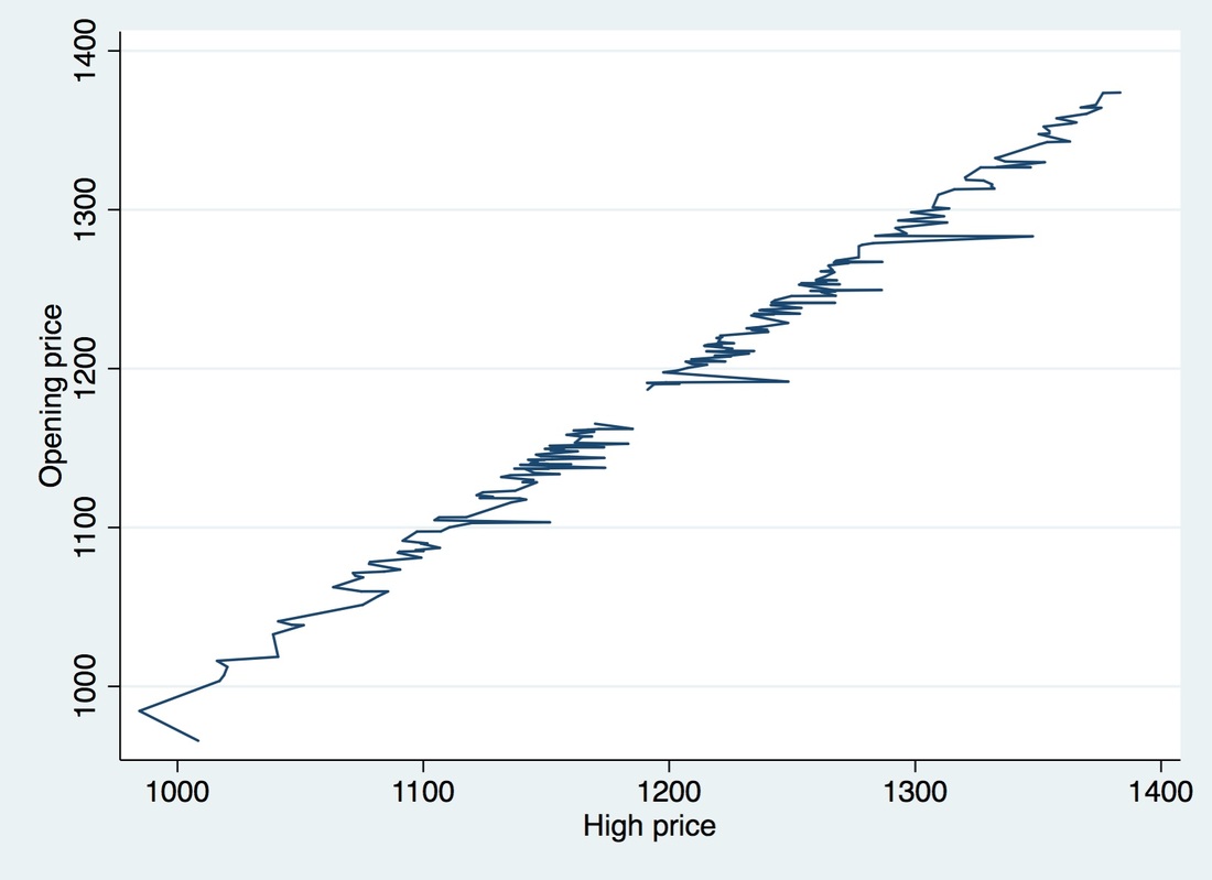
And we'd get the same resulting HTML as above and a graph that looks like:
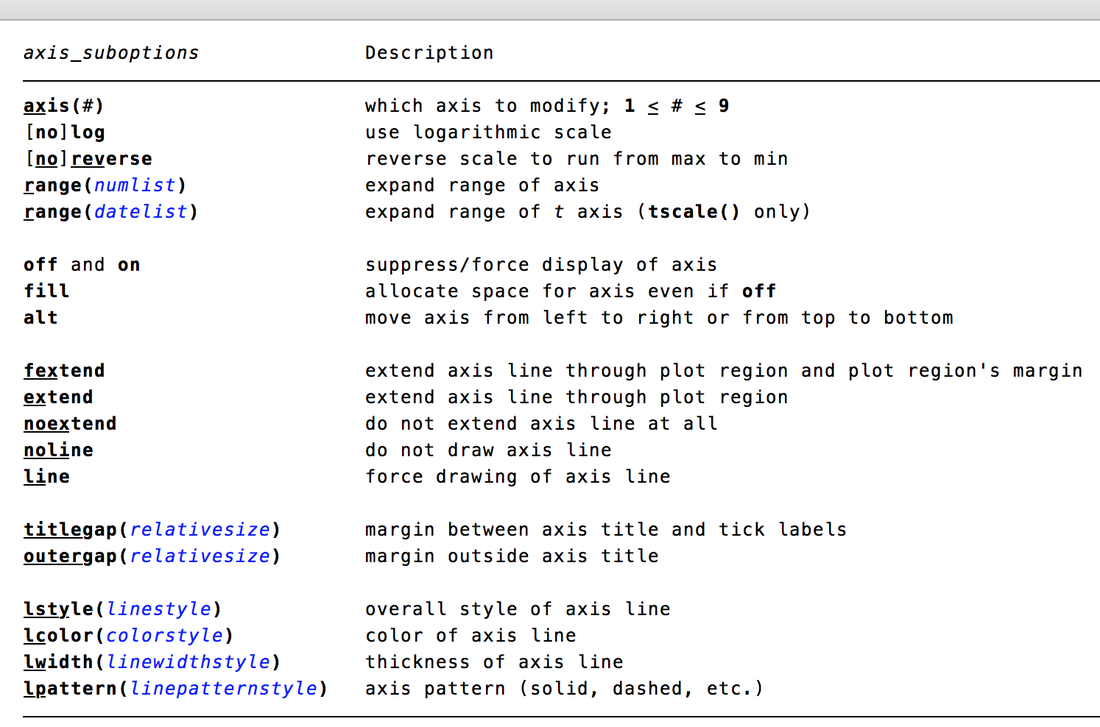
Note the cmissing() option. Did you know that existed? Did you know that cmissing(yes) was the default in Stata? I didn't know that before embarking on this project. I also didn't know about the multitude of options there are out there in twoway. Some more options that we learned about were regarding axis suboptions, like the ones pictured below:
What would our graph look like if we typed cmissing(no)? Stata would not interpolate the missing values and we'd see a gap in our graph - see graph below. By default, Google Charts API does not interpolate nulls. We also studied a whole lot about all the details and options of Google Charts API. More on that posts to come.
As you can see we really tried making it as easy as placing gchart in front of what you'd type in your twoway command. Why? Because we're here to simplify your life and we like to keep things as straightforward as possible.
So something like: scatter high low would become: gchart scatter high low Hope you've enjoyed the small preview of what's to come. I'll be posting some more examples along with our code along the way. I'll also be going into all kinds of options and more complicated examples. Stay tuned!
3 Comments
|
